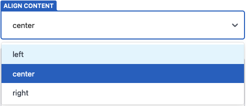
Select
The select widget allows you to pick a string value from a dropdown menu.
Name: select
UI: select input
Data type: string or array
Options:
default:optionsmust contain any default values- string values: accepts a string; defaults to an empty string. Accepts an array of strings and defaults to an empty array with
multiple: trueenabled. - object with
labelandvaluefields: accepts an object withlabelandvaluefield or an array of such objects whenmultiple: trueis enable. Defaults to no value
- string values: accepts a string; defaults to an empty string. Accepts an array of strings and defaults to an empty array with
options: (required) there are two ways to list of options for the dropdown menu:- string values: the dropdown displays the value directly
- object with
labelandvaluefields: the label displays in the dropdown; the value saves in the file
multiple: accepts a boolean; defaults tofalsemin: minimum number of items; ignored if multiple isfalsemax: maximum number of items; ignored if multiple isfalse
Example (options as strings):
- label: "Align Content"
  name: "align"
  widget: "select"
  options: ["left", "center", "right"]
Selecting the center option, will save the value as:
align: "center"
Example (options as objects):
- label: "City"
  name: "airport-code"
  widget: "select"
  options:
    - { label: "Chicago", value: "ORD" }
    - { label: "Paris", value: "CDG" }
    - { label: "Tokyo", value: "HND" }
Selecting the Chicago option, will save the value as:
airport-code: "ORD"
Example (multiple):
- label: "Tags"
  name: "tags"
  widget: "select"
  multiple: true
  options: ["Design", "UX", "Dev"]
  default: ["Design"]
Example (min/max):
- label: "Tags"
  name: "tags"
  widget: "select"
  multiple: true
  min: 1
  max: 3
  options: ["Design", "UX", "Dev"]
  default: ["Design"]
Result