Widgets
Widgets define the data type and interface for entry fields. Decap CMS comes with several built-in widgets. Click the widget names in the sidebar to jump to specific widget details. We’re always adding new widgets, and you can also create your own!
Widgets are specified as collection fields in the Decap CMS config.yml file. Note that YAML syntax allows lists and objects to be written in block or inline style, and the code samples below include a mix of both.
To see working examples of all of the built-in widgets, try making a ‘Kitchen Sink’ collection item on the CMS demo site. (No login required: click the login button and the CMS will open.) You can refer to the demo configuration code to see how each field was configured.
Common widget options
The following options are available on all fields:
required: specify asfalseto make a field optional; defaults totruehint: optionally add helper text directly below a widget. Useful for including instructions. Accepts markdown for bold, italic, strikethrough, and links.pattern: add field validation by specifying a list with a regex pattern and an error message; more extensive validation can be achieved with custom widgets- Example:
  label: "Title"
  name: "title"
  widget: "string"
  pattern: ['.{12,}', "Must have at least 12 characters"]
Default widgets
Boolean
The boolean widget translates a toggle switch input to a true/false value.
Name: boolean
UI: toggle switch
Data type: boolean
Options
default: acceptstrueorfalse; defaults tofalsewhenrequiredis set tofalse
Example config
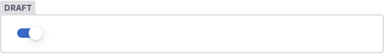
- {label: "Draft", name: "draft", widget: "boolean", default: true}
Result
Code
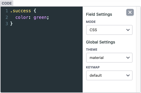
The code widget provides a code editor (powered by Codemirror) with optional syntax awareness. Can output the raw code value or an object with the selected language and the raw code value.
Name: code
UI: code editor
Data type: string
Options:
default_language: optional; default language to useallow_language_selection: optional; defaults tofalse: allows syntax to be changedkeys: optional; sets key names for code and lang if outputting an object; defaults to{ code: 'code', lang: 'lang' }output_code_only: set totrueto output the string value only, defaults tofalse
Example
- label: 'Code'
  name: 'code'
  widget: 'code'
Result
Color
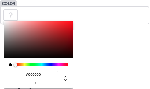
The color widget translates a color picker to a color string.
Name: color
UI: color picker
Data type: string
Options:
default: accepts a string; defaults to an empty string. Sets the default valueallowInput: accepts a boolean, defaults tofalse. Allows manual editing of the color input valueenableAlpha: accepts a boolean, defaults tofalse. Enables Alpha editing
Example
- { label: 'Color', name: 'color', widget: 'color' }
Example
- { label: 'Color', name: 'color', widget: 'color', enableAlpha: true, allowInput: true }
Result
DateTime
The datetime widget translates a datetime picker to a datetime string.
Name: datetime
UI: datetime-local input / date input / time input
Data type: Day.js-formatted datetime string
Options:
default: accepts a datetime string, or'{{now}}'to fill in the current datetime; otherwise defaults to empty string.Until 3.2.1 it defaults to current datetime. To get an empty field, set default to empty string.
format: sets storage format, displays the full date and time input in the UI. Accepts Day.js formats; defaults to ISO8601 (if supported by output format). If set,date_formatandtime_formatare not used.date_format: sets storage format and UI input type as date picker (without time). Boolean or Day.js formats.time_format: sets storage format and UI input type as time picker (without date). Boolean or Day.js formats. If used together withdate_format, the UI input will be a full datetime picker.picker_utc: (default:false) when set totrue, the datetime picker will display times in UTC. Whenfalse, the datetime picker will display times in the user’s local timezone. When using date-only formats, it can be helpful to set this totrueso users in all time zones will see the same date in the datetime picker.
The display format of the input element depends on browser locale.
Example:
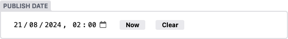
- label: "Start time"
  name: "start"
  widget: "datetime"
  default: "{{now}}"
  date_format: "DD.MM.YYYY" # e.g. 24.12.2021
  time_format: "HH:mm" # e.g. 21:07
  format: "LLL"
  picker_utc: false
Result
File
The file widget allows editors to upload a file or select an existing one from the media library. The path to the file will be saved to the field as a string.
Name: file
UI: file picker button opens media gallery
Data type: file path string
Options:
default: accepts a file path string; defaults to nullmedia_library: media library settings to apply when a media library is opened by the current widgetallow_multiple: (default:true) when set tofalse, prevents multiple selection for any media library extension, but must be supported by the extension in useconfig: a configuration object that will be passed directly to the media library being used - available options are determined by the librarymedia_folder(Beta): file path where uploaded files will be saved specific to this control. Paths can be relative to a collection folder (e.g.fileswill add the file to a sub-folder in the collection folder) or absolute with reference to the base of the repo which needs to begin with/(e.g/static/fileswill save uploaded files to thestaticfolder in a sub folder namedfiles)choose_url: (default:true) when set tofalse, the “Insert from URL” button will be hidden
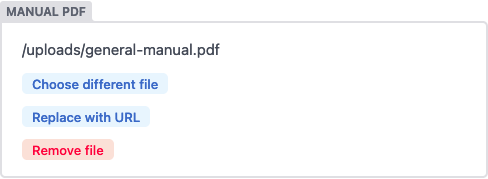
Example
- label: "Manual PDF"
  name: "manual_pdf"
  widget: "file"
  default: "/uploads/general-manual.pdf"
  media_library:
    config:
      multiple: true
File Size Limit
You can set a limit to as what the maximum file size of a file is that users can upload directly into a file field.
Example
  media_library:
    config:
      max_file_size: 1024000 # in bytes, only for default media library
Result
Hidden
Hidden widgets do not display in the UI. In folder collections that allow users to create new items, you will often want to set a default for hidden fields, so they will be set without requiring an input.
Name: hidden
UI: none
Data type: any valid data type
Options:
default: accepts any valid data type; recommended for collections that allow adding new items
Example
- {label: "Layout", name: "layout", widget: "hidden", default: "blog"}
Image
The image widget allows editors to upload an image or select an existing one from the media library. The path to the image file will be saved to the field as a string.
Name: image
UI: file picker button opens media gallery allowing image files (jpg, jpeg, webp, gif, png, bmp, tiff, svg) only; displays selected image thumbnail
Data type: file path string
Options
default: accepts a file path string; defaults to nullmedia_library: settings to apply when a media library is opened by the current widgetallow_multiple: (default:true) when set tofalse, multiple selection will be disabled even if the media library extension supports itconfig: a configuration object passed directly to the media library; check the documentation of your media library extension for availableconfigoptionsmedia_folder(Beta): file path where uploaded images will be saved specific to this control. Paths can be relative to a collection folder (e.g.imageswill add the image to a sub-folder in the collection folder) or absolute with reference to the base of the repo which needs to begin with/(e.g/static/imageswill save uploaded images to thestaticfolder in a sub folder namedimages)public_folder(defaults to the value ofmedia_folder, with an opening/if one is not already included.): specifies the folder path where the files uploaded by the media library will be accessed, relative to the base of the built site. The value of the field is generated by prepending this path to the filename of the selected file.choose_url: (default:true) when set tofalse, the “Insert from URL” button will be hidden
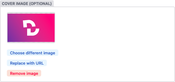
Example
- label: "Featured Image"
  name: "thumbnail"
  widget: "image"
  choose_url: true
  default: "/uploads/chocolate-dogecoin.jpg"
  media_library:
    config:
      multiple: true
Image Size Limit
You can set a limit on the maximum file size that users can upload directly into an image field.
Example
  media_library:
    config:
      max_file_size: 512000 # in bytes, only for default media library
Result
List
The list widget allows you to create a repeatable item in the UI which saves as a list of widget values. map a user-provided string with a comma delimiter into a list. You can choose any widget as a child of a list widget—even other lists.
Name: list
UI: without any fields specified, the list widget defaults to a text input for entering comma-separated values; with fields specified, the list widget contains a repeatable child widget, with controls for adding, deleting, and re-ordering the repeated widgets.
Data type: list of widget values
Options
default: you may specify a list of strings to populate the basic text field, or an array of list items for lists using thefieldsoption. If no default is declared when usingfieldorfields, will default to a single list item using the defaults on the child widgetsallow_add:falsehides the button to add additional itemsallow_remove:falsehides the button to remove items 3.8allow_reorder:falsehides the controls to reorder items 3.8collapsed: whentrue, the entries collapse by defaultsummary: specify the label displayed on collapsed entriesminimize_collapsed: whentrue, collapsing the list widget will hide all of its entries instead of showing summarieslabel_singular: the text to show on the add buttonfield: a single widget field to be repeatedfields: a nested list of multiple widget fields to be included in each repeatable iterationmax: maximum number of items in the list (works only ifminis also specified)min: minimum number of items in the list (works only ifmaxis also specified)add_to_top: whentrue, new entries will be added to the top of the list
Example (field/fields not specified):
- label: "Tags"
  name: "tags"
  widget: "list"
  default: ["news"]
Example (allow_add marked false):
- label: "Tags"
  name: "tags"
  widget: "list"
  allow_add: false
  default: ["news"]
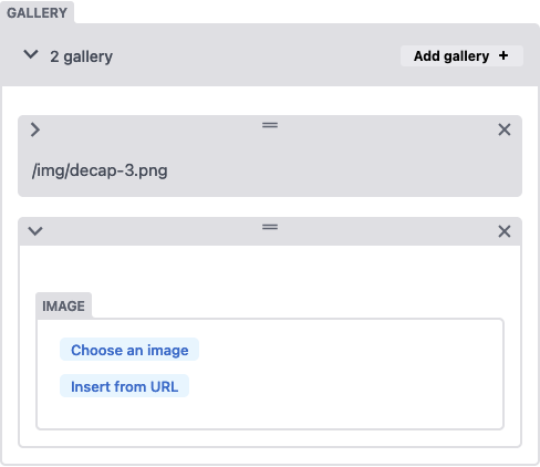
Example (with field):
- label: "Gallery"
  name: "galleryImages"
  widget: "list"
  summary: '{{fields.image}}'
  field: {label: Image, name: image, widget: image}
Example (with fields):
- label: "Testimonials"
  name: "testimonials"
  widget: "list"
  summary: '{{fields.quote}} - {{fields.author.name}}'
  fields:
    - {label: Quote, name: quote, widget: string, default: "Everything is awesome!"}
    - label: Author
      name: author
      widget: object
      fields:
        - {label: Name, name: name, widget: string, default: "Emmet"}
        - {label: Avatar, name: avatar, widget: image, default: "/img/emmet.jpg"}
Example (with default):
- label: "Gallery"
  name: "galleryImages"
  widget: "list"
  fields:
    - { label: "Source", name: "src", widget: "string" }
    - { label: "Alt Text", name: "alt", widget: "string" }
  default:
    - { src: "/img/tennis.jpg", alt: "Tennis" }
    - { src: "/img/footbar.jpg", alt: "Football" }
- Example (
collapsedmarkedfalse):
- label: "Testimonials"
  name: "testimonials"
  collapsed: false
  widget: "list"
  fields:
    - {label: Quote, name: quote, widget: string, default: "Everything is awesome!"}
    - {label: Author, name: author, widget: string }
Example (minimize_collapsed marked true):
- label: "Testimonials"
  name: "testimonials"
  minimize_collapsed: true
  widget: "list"
  fields:
    - {label: Quote, name: quote, widget: string, default: "Everything is awesome!"}
    - {label: Author, name: author, widget: string }
Example (with max & min):
- label: "Tags"
  name: "tags"
  widget: "list"
  max: 3
  min: 1
  default: ["news"]
Example (add_to_top marked true):
- label: "Tags"
  name: "tags"
  widget: "list"
  add_to_top: true
Result
Map
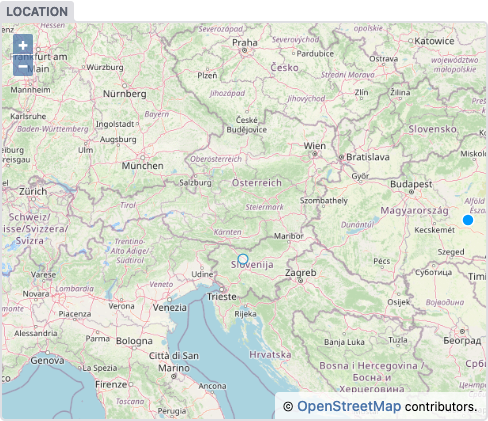
The map widget allows you to edit spatial data using an interactive map. Spatial data for a single piece of geometry saves as a GeoJSON string in WGS84 projection.
Name: map
UI: interactive map
Data type: GeoJSON string
Options:
decimals: accepts a number to specify precision of saved coordinates; defaults to 7 decimalsdefault: accepts a GeoJSON string containing a single geometry; defaults to an empty stringtype: accepts one string value ofPoint,LineStringorPolygon; defaults toPoint
Example
- {label: "Location", name: "location", widget: "map" }
Result
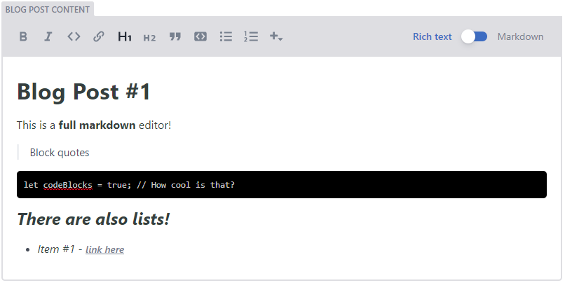
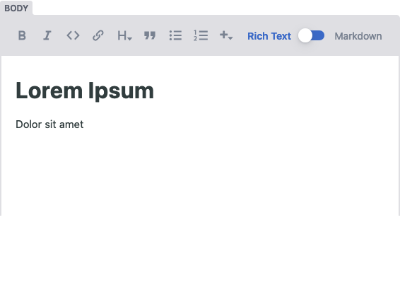
Markdown
The markdown widget provides a full-fledged text editor allowing users to format text with features such as headings and blockquotes. Users can change their editing view with a handy toggle button.
Please note: If you want to use your markdown editor to fill a markdown file’s contents after its frontmatter, you’ll have to name the field body so the CMS recognizes it and saves the file accordingly.
Name: markdown
UI: full text editor
Data type: markdown
Options
default: accepts markdown contentminimal: accepts a boolean value,falseby default. Sets the widget height to minimum possible.buttons: an array of strings representing the formatting buttons to display (all shown by default). Buttons include:bold,italic,strikethrough,code,link,heading-one,heading-two,heading-three,heading-four,heading-five,heading-six,quote,bulleted-list, andnumbered-list.editor_components: an array of strings representing the names of editor components to display (all shown by default). Decap CMS includesimageandcode-blockeditor components by default, and custom components may be created and registered.modes: an array of strings representing the names of allowed editor modes. Possible modes arerawandrich_text. A toggle button appears in the toolbar when more than one mode is available.sanitize_preview: accepts a boolean value,falseby default. Sanitizes markdown preview to prevent XSS attacks - might alter the preview content.
Example
- { label: 'Blog post content', name: 'body', widget: 'markdown' }
This would render as:
Please note: The markdown widget outputs a raw markdown string. Your static site generator may or may not render the markdown to HTML automatically. Consult with your static site generator’s documentation for more information about rendering markdown.
Remark plugins
You can register plugins to customize remark, the library used by the richtext editor for serializing and deserializing markdown.
// register a plugin
CMS.registerRemarkPlugin(plugin);

// provide global settings to all plugins, e.g. for customizing `remark-stringify`
CMS.registerRemarkPlugin({ settings: { bullet: '-' } });
Note that netlify-widget-markdown currently uses remark@10, so you should check a plugin’s compatibility first.
Result
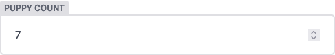
Number
The number widget uses an HTML number input, saving the value as a string, integer, or floating point number.
Name: number
UI: HTML number input
Data type: string by default; configured by value_type option
Options
default: accepts string or number value; defaults to empty stringvalue_type: acceptsintorfloat; any other value results in saving as a stringmin: accepts a number for minimum value accepted; unset by defaultmax: accepts a number for maximum value accepted; unset by defaultstep: accepts a number for stepping up/down values in the input; 1 by default
Example
- label: "Puppy Count"
  name: "puppies"
  widget: "number"
  default: 2
  value_type: "int"
  min: 1
  max: 101
  step: 2
Result
Object
The object widget allows you to group multiple widgets together, nested under a single field. You can choose any widget as a child of an object widget—even other objects.
Name: object
UI: a field containing one or more child widgets
Data type: list of child widget values
Options
default: you can set defaults within each sub-field’s configurationcollapsed: if added and labeledtrue, collapse the widget’s content by defaultsummary: specify the label displayed when the object is collapsedfields: (required) a nested list of widget fields to include in your widget
Example
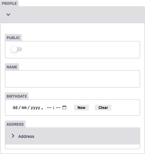
- label: "Profile"
  name: "profile"
  widget: "object"
  summary: '{{fields.name}}: {{fields.birthdate}}'
  fields:
    - {label: "Public", name: "public", widget: "boolean", default: true}
    - {label: "Name", name: "name", widget: "string"}
    - label: "Birthdate"
      name: "birthdate"
      widget: "date"
      default: ""
      format: "MM/DD/YYYY"
    - label: "Address"
      name: "address"
      widget: "object"
      collapsed: true
      fields:
        - {label: "Street Address", name: "street", widget: "string"}
        - {label: "City", name: "city", widget: "string"}
        - {label: "Postal Code", name: "post-code", widget: "string"}
Result
Relation
The relation widget allows you to reference items from another collection. It provides a search input with a list of entries from the collection you’re referencing, and the list automatically updates with matched entries based on what you’ve typed.
Name: relation
UI: text input with search result dropdown
Data type: data type of the value pulled from the related collection item
Options:
collection: (required) name of the referenced collection (string)value_field: (required) name of the field from the referenced collection whose value will be stored for the relation. For nested fields, separate each subfield with a.(e.g.name.first). For list fields use a wildcard*to target all list items (e.g.categories.*).search_fields: (required) list of one or more names of fields in the referenced collection to search for the typed value. Syntax to reference nested fields is similar to that of value_field.file: allows referencing a specific file when the referenced collection is a files collection (string)display_fields: list of one or more names of fields in the referenced collection that will render in the autocomplete menu of the control. Defaults tovalue_field. Syntax to reference nested fields is similar to that of value_field.default: accepts any widget data type; defaults to an empty stringmultiple: accepts a boolean, defaults tofalsemin: minimum number of items; ignored if multiple isfalsemax: maximum number of items; ignored if multiple isfalseoptions_length: accepts integer to override number of options presented to user. Defaults to20.filters: 3.1.5 allows adding filters by which the available options are filtered. You can add filters which are a pair offieldand the allowedvalues, where the widget will only show options (collection items) that satisfy all the filters. A collection item satisfies a filter if the value offieldis one of the values invalues.- Referencing a folder collection example (assuming a separate “authors” collection with “name” and “twitterHandle” fields with subfields “first” and “last” for the “name” field):
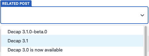
- label: "Post Author"
  name: "author"
  widget: "relation"
  collection: "authors"
  search_fields: ["name.first", "twitterHandle"]
  value_field: "name.first"
  display_fields: ["twitterHandle", "followerCount"]
The generated UI input will search the authors collection by name and twitterHandle, and display each author’s handle and follower count. On selection, the author’s name is saved for the field.
String templates example
This assumes a separate “authors” collection with “name” and “twitterHandle” fields with subfields “first” and “last” for the “name” field:
- label: "Post Author"
  name: "author"
  widget: "relation"
  collection: "authors"
  search_fields: ['name.first']
  value_field: "{{slug}}"
  display_fields: ["{{twitterHandle}} - {{followerCount}}"]
The generated UI input will search the authors collection by name, and display each author’s handle and follower count. On selection, the author entry slug is saved for the field.
Referencing a file collection list field example
This assumes a separate “relation_files” collection with a file named “cities” with a list field “cities” with subfields “name” and “id”:
- label: "City"
  name: "city"
  widget: "relation"
  collection: "relation_files"
  file: "cities"
  search_fields: ["cities.*.name"]
  display_fields: ["cities.*.name"]
  value_field: "cities.*.id"
The generated UI input will search the cities file by city name, and display each city’s name. On selection, the city id is saved for the field.
- Filters example
- label: Posts
  name: posts
  widget: relation
  collection: posts
  multiple: true
  search_fields: [title]
  display_fields: [title]
  value_field: '{{slug}}'
  filters:
    - field: draft
      values: [false]
In this example, the relation widget will only show and allow posts that are not a draft (i.e. draft field is false). For example, if we have 20 posts in the CMS of which 5 have draft set to true, then we will only see the other 15 posts as options in the relation widget.
Multiple filters can be added:
filters:
  - field: draft
    values: [false]
  - field: title
     values: ['post about cats', 'post about dogs']
In this case only the posts with draft set to false and a title that is either ‘posts about cats’ or ‘post about dogs’ will be options seen in the relation widget.
Result
Select
The select widget allows you to pick a string value from a dropdown menu.
Name: select
UI: select input
Data type: string or array
Options:
default:optionsmust contain any default values- string values: accepts a string; defaults to an empty string. Accepts an array of strings and defaults to an empty array with
multiple: trueenabled. - object with
labelandvaluefields: accepts an object withlabelandvaluefield or an array of such objects whenmultiple: trueis enable. Defaults to no value
- string values: accepts a string; defaults to an empty string. Accepts an array of strings and defaults to an empty array with
options: (required) there are two ways to list of options for the dropdown menu:- string values: the dropdown displays the value directly
- object with
labelandvaluefields: the label displays in the dropdown; the value saves in the file
multiple: accepts a boolean; defaults tofalsemin: minimum number of items; ignored if multiple isfalsemax: maximum number of items; ignored if multiple isfalse
Example (options as strings):
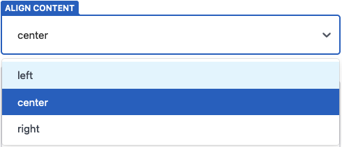
- label: "Align Content"
  name: "align"
  widget: "select"
  options: ["left", "center", "right"]
Selecting the center option, will save the value as:
align: "center"
Example (options as objects):
- label: "City"
  name: "airport-code"
  widget: "select"
  options:
    - { label: "Chicago", value: "ORD" }
    - { label: "Paris", value: "CDG" }
    - { label: "Tokyo", value: "HND" }
Selecting the Chicago option, will save the value as:
airport-code: "ORD"
Example (multiple):
- label: "Tags"
  name: "tags"
  widget: "select"
  multiple: true
  options: ["Design", "UX", "Dev"]
  default: ["Design"]
Example (min/max):
- label: "Tags"
  name: "tags"
  widget: "select"
  multiple: true
  min: 1
  max: 3
  options: ["Design", "UX", "Dev"]
  default: ["Design"]
Result
String
The string widget translates a basic text input to a string value. For larger textarea inputs, use the text widget.
Name: string
UI: text input
Data type: string
Options:
default: accepts a string; defaults to an empty string
Example
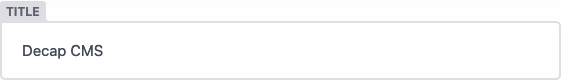
- {label: "Title", name: "title", widget: "string"}
Result
Text
The text widget takes a multiline text field and saves it as a string. For shorter text inputs, use the string widget.
Name: text
UI: HTML textarea
Data type: string
Options:
default: accepts a string; defaults to an empty string
Example
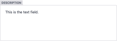
- {label: "Description", name: "description", widget: "text"}
Result